REDESIGN
CASE STUDY

BRANDING / UI+UX / NFORMATION & INNER PAGES DESIGN

A redesign that makes the softlabny clearer, visually aesthetic, and a good user experience software service agency.

OVERVIEW

Brief

SoftLabNY is a newyork based software development and team builder company. Redesign the SoftlabNY to create a beter user experience and a better visual look.

Challenges

Create easy-to-understand projects deal for clients.
Explore hiring price and method seamlessly.
Allow client’s to interview with talents.
Bridge the gap between clients and product manager. Keep updated 24/7.

Outcome

The redesign makes the application and overall user experience clearer, friendlier, and true to SoftlabNY services.

Kickoff

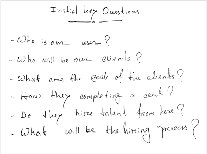
Starting off, I asked myself a few initial questions. Who is our primary user? Who will be our clients? What are the goals of the clients? How they completing a deal? Do they hire talent from here? After discussed with stackholders to establish archetypes later on, it became evident that the goals they wanted to accomplish all fell within the same categories.

Competitive Analysis

In order to construct a concise and solid foundation for SoftlabNY, I had to venture out and see what the relevents software applications were already doing and what user goals they were not reaching. I found that only two of the four main competitors offered a smooth hiring process with good visualiation. On the other side most of the competitors are poor UI Visualitation and User experience.

problem with the current design

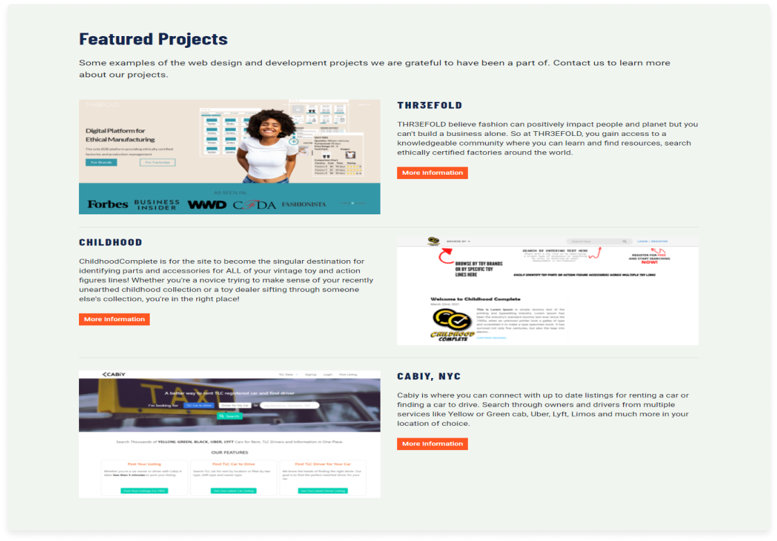
The current design has lots of UI/UX issue and it is unfriendly, nonmodern and threepenny to softlabNY.

  • Poor color contrast
  • Irelevent BG image
  • Repulsive navigation and CTA
  • No hiring talent process
  • Distress section organising
  • Outdated Iconography
  • Undesirable CTA
  • Ungracious project presention
  • Ineffective buttons
  • Poor project images
  • Unproductive CTA design
  • Inexpensive form design
  • Uninformative footer
  • Missing social media icon
  • Inaesthetic design
Design Objective

A redesign that makes the softlabny clearer, visually aesthetic, and a good user experience software service agency

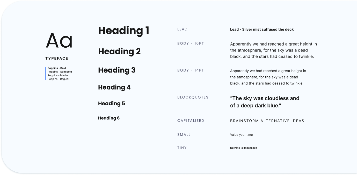
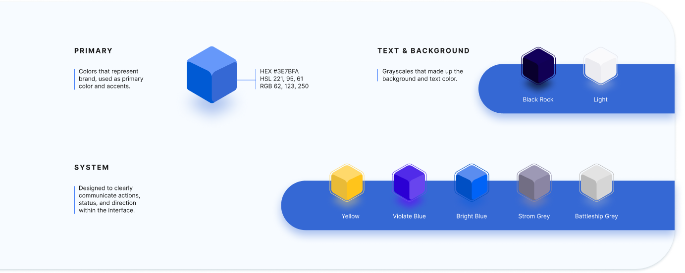
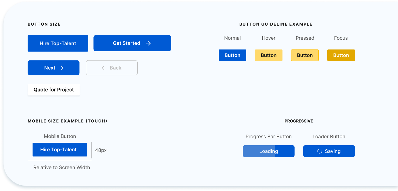
style guide

The vital ground for website sucess is consistencey. Our style guide represents the main company values of transparency, creativity, and people-orientation. Each element matters and plays an important role in creating a general branding identity.